How to Choose the Right Tile Layout
Posted on 2018-04-03 09:43:48How to Choose the Right Tile Layout
Brick, stacked, mosaic and more
— get to know the most popular tile layouts and see which one is best for your room
Whether you’re splurging on a rare natural stone or standing by classic porcelain, choosing a tile type is only part of the design decision. The way the tile is installed also matters. To help you figure out the best layout for your kitchen, bathroom and beyond, here are some of the most popular options.
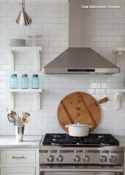
Brick
This is the classic layout for subway tile. In a brick pattern, each row of tiles is typically offset by half a tile width, which results in long, horizontal lines that can subtly widen a room. It’s a timeless layout that can work for any rectangular tile, making it a great option for virtually any space.
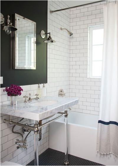
A brick layout can look especially stylish when paired with a contrasting grout color, such as gray grout with white tile, emphasizing the geometric pattern.
Where to use a brick pattern: Anywhere, but especially in spaces where one simple tile is used throughout.
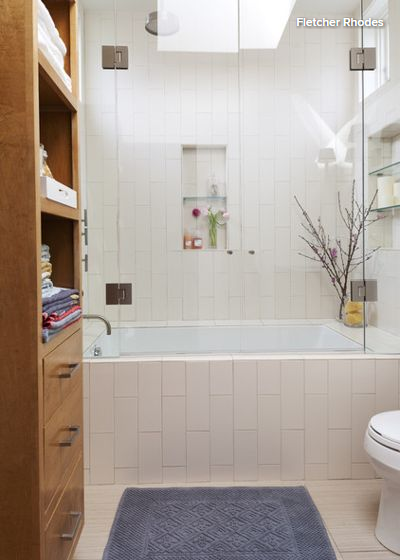
Vertical Brick
Choosing a brick pattern but orienting it vertically takes the widening effect and rotates it, emphasizing the height of a space instead. It also adds a touch of contemporary appeal by being a little unexpected but still classic, for a fun twist that isn’t too trendy.
When to use a vertical brick pattern: To lift the ceiling height, such as in a compact bathroom.

Large Brick
An oversize brick pattern is not technically different from a standard brick, but the effect can be different, especially with rich stone tiles. Here the pattern helps minimize the visual impact of the grout, allowing the tiles to have a more seamless appearance.
When to use a large brick layout: When you want oversize tiles to appear as a continuous plane of stunning unbroken material.
Tip: Use color-matched grout to enhance the effect.
Find a bathroom designer to help redo your bathroom tile
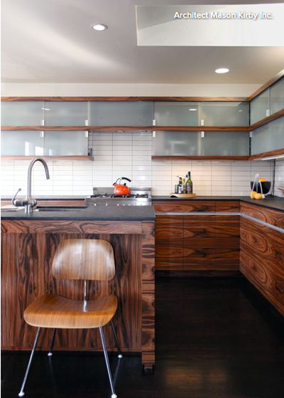
Stacked
This is the simplest layout. In a stacked pattern, the tiles are aligned to form a basic repeating grid. This results in a modern look that works well with clean shapes and crisp angles, and plays against the organic forms of exotic woods.
Where to use a stacked layout: In a modern space with rectilinear forms, especially with a beveled-edge tile or bright grout, which emphasizes the Zen-like simplicity.
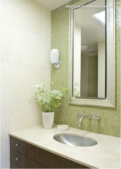
Mosaics
While the word “mosaic” may bring to mind complex forms that create lively patterns and images, in design terms a mosaic is simply any small tile in a repeated shape (or set of shapes), typically attached in small sheets to matting for easy installation. A very common example is a 1-inch by 1-inch square, although endless shapes and patterns are available.
Browse thousands of mosaic tile options on Houzz
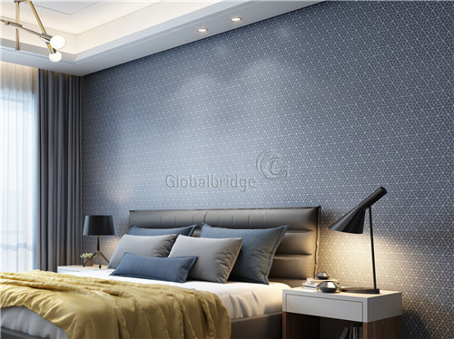
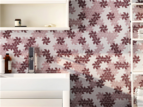
Mosaics are more common for accent areas (rather than full-height walls), because they require more grout. This means they can require more maintenance if exposed to heavy soil or moisture, which can be an issue in mildew-prone bathrooms.
However, they can create a rich and subtle multi-tonal effect that has the appeal of luxe stone without the luxe cost, making them a popular backsplash option.
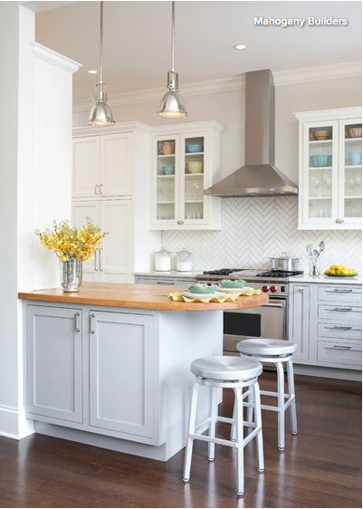
Herringbone
A herringbone pattern is achieved by laying tiles at right angles into zigzag formations or by a preformed mosaic. Either way, the look is sophisticated and has high-end appeal, even with a simple material. However, this pattern will inevitably require additional cutting of tiles at the borders, so it can create some extra material waste.
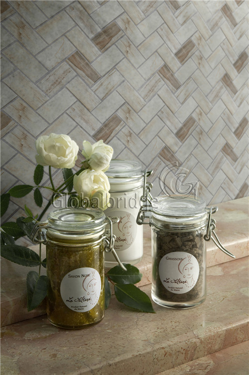
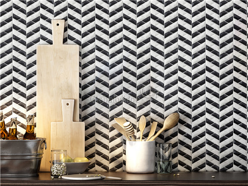
The angular nature of this pattern creates a dynamic energy, which can be perfect for accent walls but a little overwhelming if used on too large a surface.
Where to use a herringbone layout: In a traditional or transitional kitchen (especially in classic white on white), or with a long, thin tile to form a powerful accent anywhere.
How do you think of these tiles for chosing the layout? Welcome to tell us your idea!
PS:Reproduces the article from: https://www.houzz.com/ideabooks/42700445/list/how-to-choose-the-right-tile-layout